
“Alive”, tel est le nouveau concept identitaire que vient de dévoiler Xiaomi, entreprise chinoise d’électronique et d’informatique basée à Pékin et spécialisée dans la téléphonie mobile et l’électronique grand public.
Ce nouveau concept se traduit par une nouvelle identité visuelle, présentée par le communiqué de presse de la marque comme “a refreshed new corporate visual identity, fusing oriental philosophy with the design concept of “Alive””.
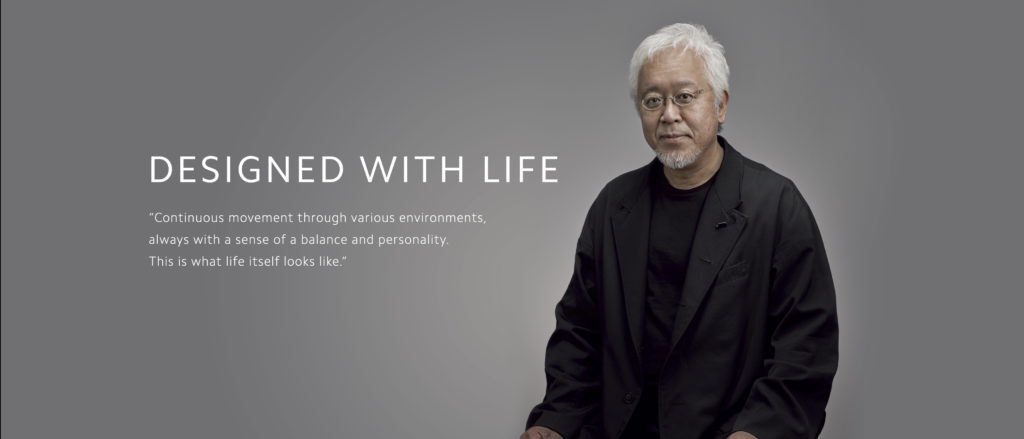
Xaomi’s brand new logo was designed by a world-renowned designer, professor of Musashino Art University and the President of the Nippon Design Center (NDC), Kenya HARA. Adopting a softer, rounder contour on the corners of the previously squared logo, along with redesigned “MI” typography, the new logo is now more aesthetically pleasing. Corporate color remains orange to continue to convey the liveliness and youthfulness of Xiaomi. Black and silver will also be used as supplemental colors to accommodate high-end product line applications.
Le résultat :
Faut-il être chinois pour percevoir toute la puissance de ce “brand refresh” ?